About the museum
ASU Art Museum is part of Arizona State University (ASU), a comprehensive knowledge enterprise dedicated to the simultaneous pursuit of excellence, broad access to quality education and meaningful societal impact. ASU is a public research university with a charter that states, “we are measured not by whom we exclude, but rather by whom we include and how they succeed; advancing research and discovery of public value; and assuming fundamental responsibility for the economic, social, cultural and overall health of the communities it serves.” For the 9th year in a row, ASU was awarded No. 1 in innovation by the U.S. News & World Report Monday in its annual “Most Innovative Schools.”
Arizona State University is “one university in many places” — four distinctive campuses throughout metropolitan Phoenix, as well as locations around the state, country and world. Each provides access to the university’s strength and innovation, and all offer attributes and focuses to meet the needs of any learner. With 145,000 learners on its campuses and online, 34% (1 in 3) of ASU’s student body identify as first-generation college students; graduating more Native students than any other university in the US; and is one of the largest universities per capita in the US for students earning their degrees with G.I. Bill and Department of Defense tuition assistance benefits.
ASU Art Museum centers art and artists in the service of community well-being and social good. The Museum is a learning-centered teaching institution, providing interdisciplinary learning opportunities for students from across the university ranging from the sciences, humanities, journalism, sociology and schools of arts and design. A teaching museum, much like a teaching hospital, is responsible for training the next generation of arts professionals and are the frontrunners in research in art history and museum studies while delivering the highest possible level of artistic standards through collection teaching, exhibition making, research and audience engagement.
The museum is different from other non-profit art museums in the region because of its unique ability to leverage the resources of the largest public research university in the country for community good. ASUAM fulfills ASU’s Design Principles by serving as a bridge connecting the breadth and scope of scholarly research and learning to the experience, knowledge and needs of our local communities, thereby co-creating and creating arts and culture opportunities available for all.
Two locations give ASU Art Museum a broad reach in terms of programs and audiences:
Nelson Fine Arts Center
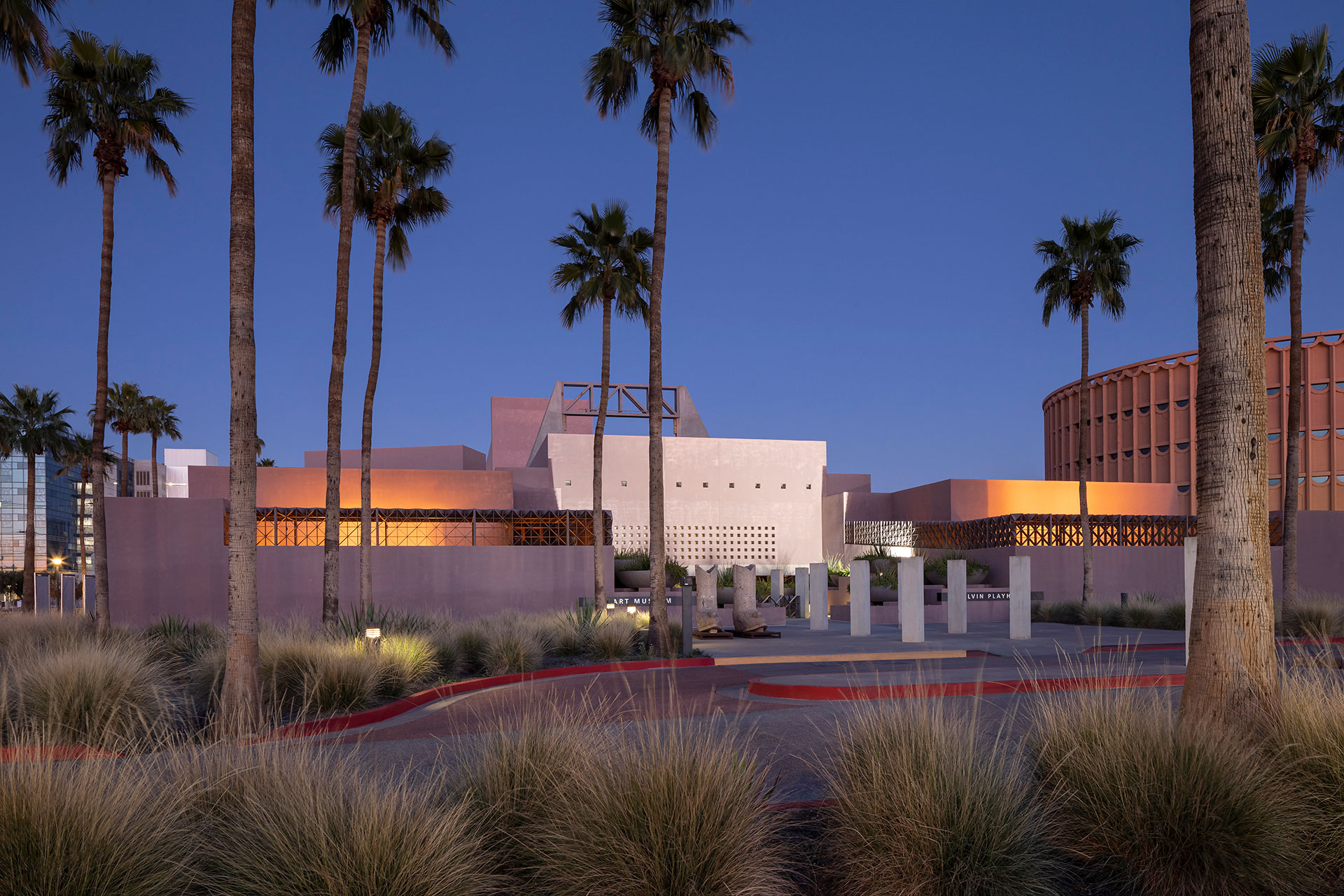
Designed by Antoine Predock and opened in 1989, the Nelson Fine Arts Center facility is located on ASU’s Tempe campus with three floors of year-round exhibitions that rotate seasonally and the award-winning museum store.
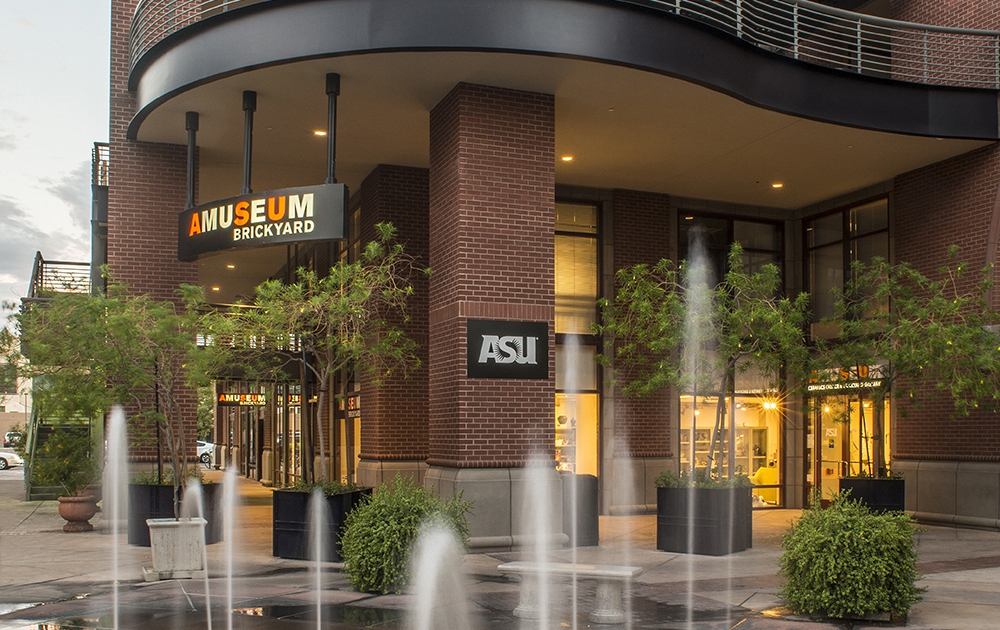
The Brickyard located in downtown Tempe on Mill Avenue houses the Ceramics Research Center, a national and international destination for the study and appreciation of ceramics, and the Brickyard Gallery.
The Brickyard
The Brickyard located in downtown Tempe on Mill Avenue houses the Ceramics Research Center, a national and international destination for the study and appreciation of ceramics, and the Brickyard Gallery.
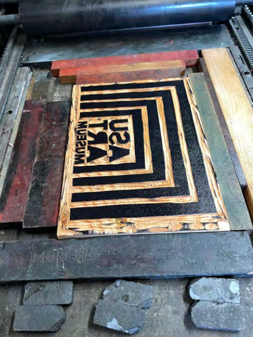
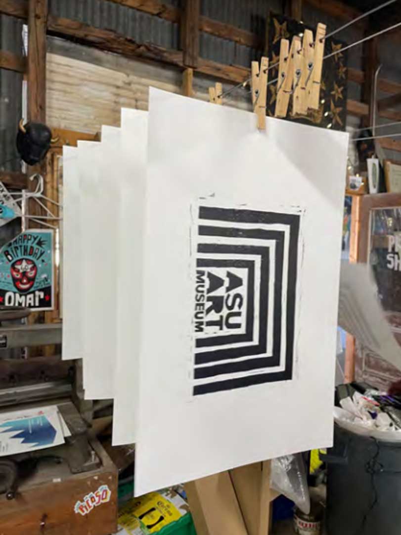
Artist Cruz Ortiz on his design of the new signature graphic for the ASU Art Museum:
The museum should always function as an interactive beacon, where ideas and practice methods create a sacred space for a community. The museum is a place where we should grow as we continue our journey through humanity and the cosmos. The ASU Art Museum is situating itself into this delicate and prudent position for a very specific community. The approach to creating this visual identity was to somehow capture the sense of stability and safety. It is the foundation of how we understand architecture. Placemaking is not an easy thing to establish, and it is even much more difficult to create a symbol that encapsulates how we understand what a museum is supposed to be.
This design is a hand-cut, handmade forged placa (plaque). It was developed using two printmaking styles, woodcut and screen printing. The internal text was cut from hardwood birch-ply, and proof pressed through a 1940s Vandercook Letterpress. The post and lintel shell was created using hand-cut paper and film stencils on my 30-year-old screen printing press. Both of these mediums for me have always been a staple within my art canon, and for good reason. These mediums both articulate a sense of urgency and an importance for democratic distribution. I wanted this signature graphic to be flexible in use and to behave on its own. It was important for this symbol to not only represent a sacred space but to translate into a space for exchange.
Arte para todos. Art for all.


